Overview
By the time I start designing the finished product you’ll one day interact with, I already have completed all of pre-work to develop a clear vision for what it will look like and how it will feel.
This stage of Visual Design is all about the details. What will the buttons and icons look like? Which typefaces will we use? What copy will we use and what content do we need?

Core User Interface
The core user interface is usually 1-3 primary interfaces the user will interact with for the core functionality of a product. The Core UI will establish UI themes to be adopted by the rest of the product.
User interfaces may be made up of various components but the purpose is the same: provide functionality for users to interact with or content for them to consume.
The core UI for the Mojichat iMessage Extension was inevitably the user's library of Mojicons, placing the content users wanted at their fingertips.
Although most products will include some unique interface elements, it's a best practice to leverage standardized UI elements whenever available via Material Design or iOS. Otherwise, leverage real world examples to fuel new designs.
Users are often already familiar with these interactions and have an expectation on how they behave, reducing friction for new users.


The core UI for Fibbol included a standard iOS tab bar for navigation, a familiar content layout and buttons that we already use every day.
Although many people are happy wearing black everyday, color is an easy way to add character to a product.
In addition, colors help manage user's attention as they interact with your product, with UI elements altering colors when appropriate.
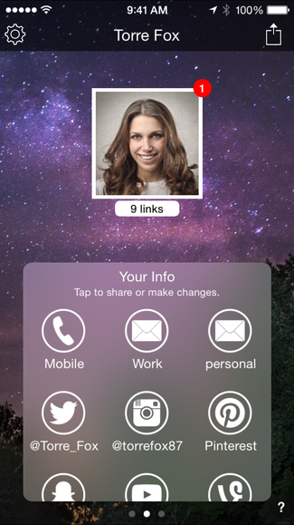
The color scheme for Tap did not exactly follow this logic as we nearly exclusively used shades of black & white. The use of black was based on our key value proposition of privacy and discretion. By leveraging gradients, the icons even looked sexy in black... some would say.
On the other hand, a core interface might require a totally unique user experience. When designing a core interface in augmented reality, there were few UI elements to manage but significant detail in how, when and what content to show at what time.

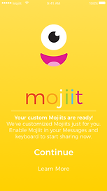
With Mojiit AR, the core UI was the user's camera with only 2 static buttons to access the camera or settings. All other functionality was reserved in the incoming bubbles... a virtual stream of messages and content fed into the room around you.
Wireframing
Although some wireframes have already been built at this point to guide early prototypes & the core user interface, the bulk of my wireframing is usually completed after the primary UI is designed.
Wireframes are rough sketches of the layout and functionality in a user interface used to demonstrate user experiences without investment in high quality, finished designs.
Wireframes are especially useful in designing supporting views for a few tangible reasons. I don’t need to waste time with details like the accent color in a Settings pane or dozens of icons.


youPass wireframes shown left compared with a high fidelity mockup to the right.
Wireframes help manifest clear opportunities to reuse interfaces for similar views, minimizing development time later while offering a consistent experience across the product.
In designing Mojiit, Tap and some other projects, I designed a wireframe for an Alert View simple and flexible enough to capture dozens of use cases throughout the app.
Wireframing is a great tool to visualize the experience in each user flow.
By tracing each point of user interaction across the wireframes involved in particular user flows, inefficiencies and shortcuts can quickly manifest.

High Fidelity Design
This is where we finally start to see some finished product. At this point, we have a great design concept as a result of the rapid prototyping phase. We’ve spent even more time designing the details in the core user interface(s). We’ve mapped out all of our user functions and flows. We have wireframes for every interface the user will interact with along the way. It’s time to start completing the high fidelity designs of each user interface that will guide development of the finished product.
Icons & Graphic Design
As a UX Designer, I create or administer each icon or image that goes into the finished product. I love to design icons while I’m working on the UI to help truly realize a cohesive design.
With flat design, I often leverage standard icons from Material Design, iOS or licensed icon collections when available. On the other hand, I've made dozens of icons from scratch and have managed graphic designers producing hundreds.
Often, it's easier to design finished graphics that can be easily used by developers in-app rather than have them recreate the graphics in code.


For more complex icons or large icon sets, I've hired or managed professional graphic designers to get each icon perfect.
Animation and
3D Asset Creation
Animation brings visual experiences to life. Expression transforms arbitrary faces into characters. Animation is an incredibly powerful tool in user interface and experience design.


In a Creative Director capacity, I've led the creation of hundreds of animations, 3D models and textures. I recruited and managed Technical Artists, 3D Artists and animators. Together, we've brought concepts to life under tough technical limitations.
In Mojichat, I designed a series of idle animations our engineering team would cycle through when a user remained idle in certain views. The animations delighted our users and helped bring the character to life.

I designed over a dozen animations ranging from 1-7s used to help realize 3D changes as the user navigation option menus.
Under my creative direction, our animation team produced hundreds of 3D, animated Mojicons that our users loved.
Copywriting & Localization
When people interact with a product they likely do not want to read a book. Clear, concise and effective use of language is imperative in a user interface. Typos or improper grammar can easily undermine the quality of a product but poor language can lead to undesired behavior or confusion.
Although English is my only language (so far!), I understand communicating to users in their native language is incredibly valuable whenever possible. I worked with premium online services to translate content I've drafted for App Store pages to launch internationally. I verified each translation with native speakers and was impressed to find near perfect translations.
At Twin Health, I helped manage a localization project where we translated hundreds of thousands of words to Spanish. This included all of the in-app UX writing end to end, dozens of longer form articles and quizzes, slide decks, and video content. It was a massive undertaking that helped us unlock access for non-English speaking members for the first time.
User Design Validation
User validation of finished designs will look different for each product but can offer incredible insight in actual behavior that is sometimes quite different than what we intended. As described as part of my user research process, user validation of a product design is important throughout the entire design process.
The goal here is that your actual users are able to intuitively navigate your product and perform key functions at ease. Observing a person’s first interaction with a product and their natural navigation to perform key functions can offer key areas of improvement in the finished product design.
For each interface and user flow, I identify metrics that we'll test against to ensure fast, effective completion of intended tasks and outcomes.


